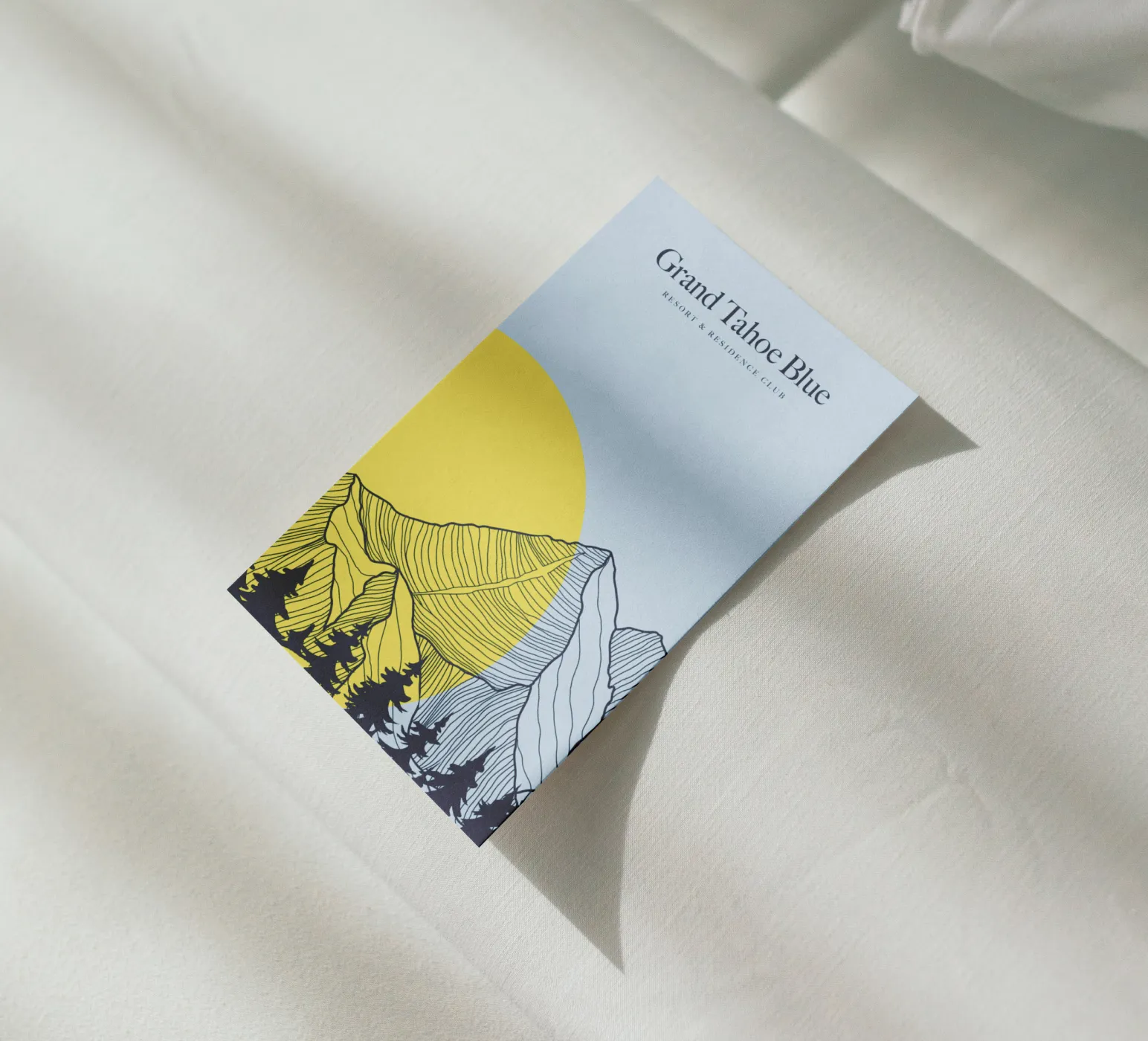
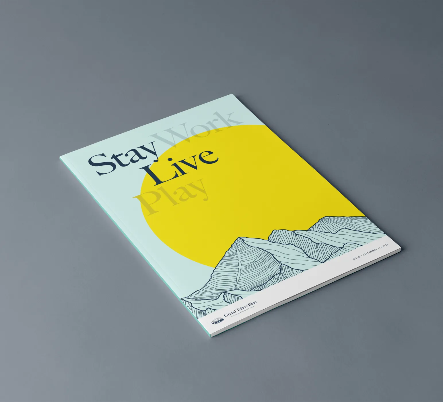
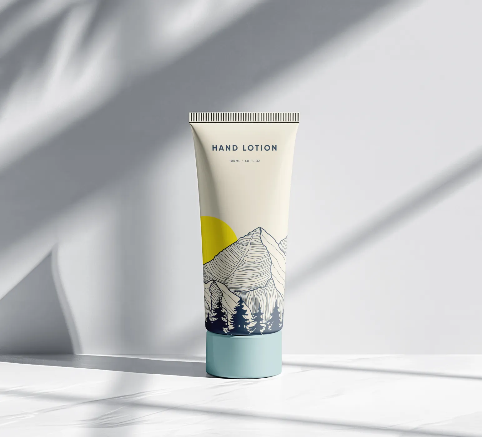
Brand System
The branding aimed to bridge traditional luxury with the resort’s tech-forward vision. Drawing inspiration from Lake Tahoe’s natural palette, the identity uses serene blues, green-blues, and soft beige pastels, contrasted with a vibrant, fluorescent yellow to reflect both the tranquility of the surroundings and the modern, high-tech amenities. The logo itself, featuring the mountains, trees, lake, and the sun, is not only the brand’s identifier but also functions as a recurring design element across marketing collateral. The branding visually connects the resort to its geographic roots while maintaining a sleek, modern feel that aligns with the technological sophistication of the development.