Email me at jlo2006@gmail.com
View

Rare Earth Processing Company

Web Design, Print
Brand identity and website build for a U.S.-based critical minerals company developing domestic separation, refining, and recycling infrastructure for heavy rare earth elements. The work supports the company's investor, government, and strategic partnership conversations during a pre-operational growth stage.
Branding
Logo Design
Web Design
Messaging
Challenges
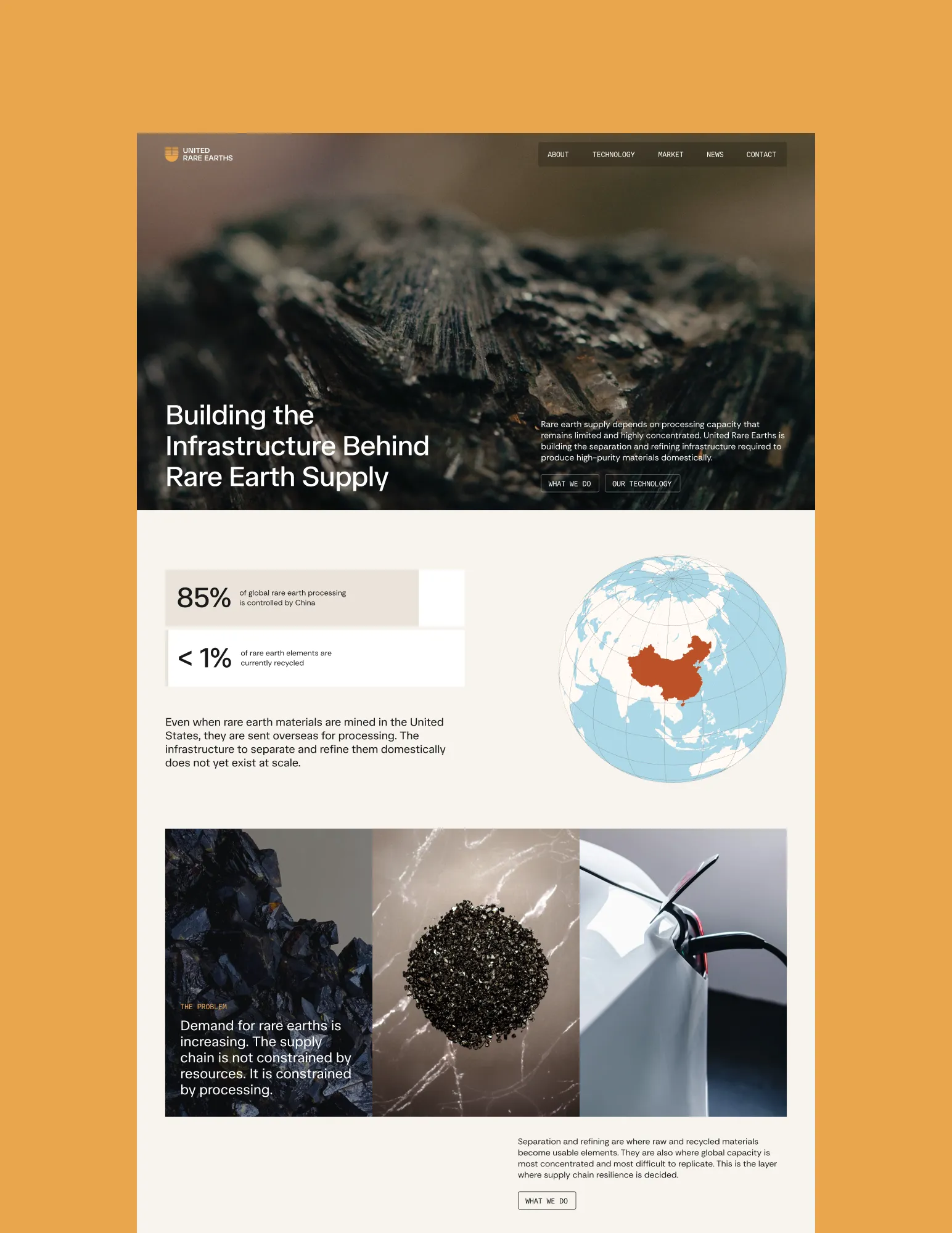
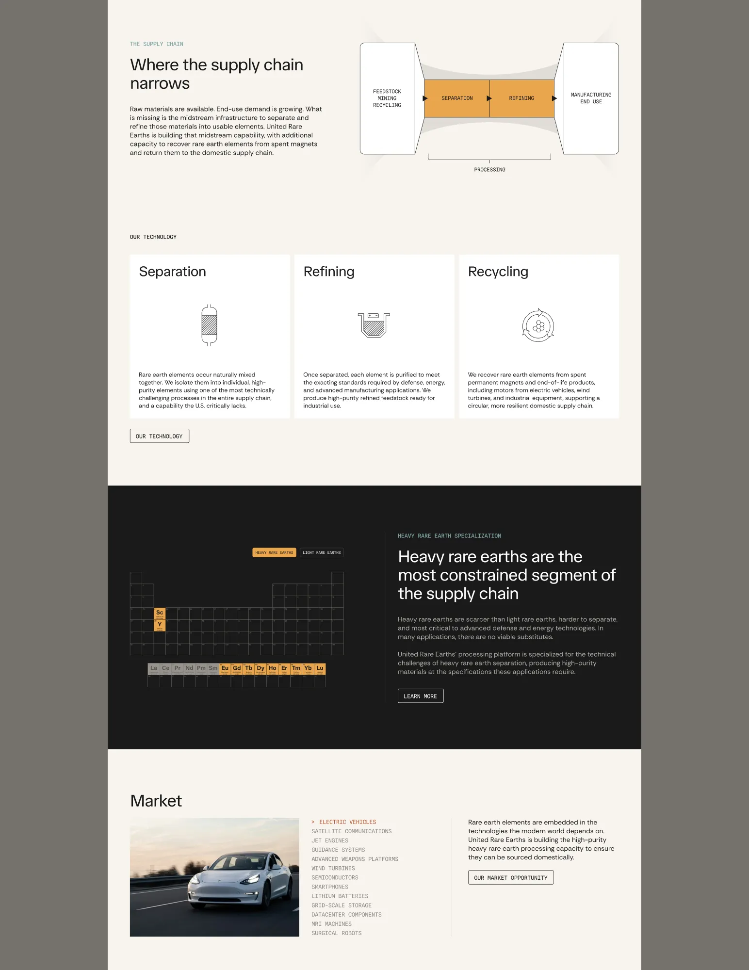
The company operates in the midstream of the rare earth supply chain, separating and refining raw and recycled materials into high-purity elements. It's a technically dense, geopolitically sensitive industrial capability that audiences needed to understand quickly and take seriously, including investors, government and policy stakeholders, and strategic partners in defense, energy, and advanced manufacturing. The work needed to build the positioning, the identity system, and the website that would carry the company through its next phase of fundraising and development.
Logo
The brief was a logomark that read as simple and minimalist but specific to what the company does. To find something distinctive, the design process started with the science: hydrometallurgy, chromatography, and the chemistry of rare earth separation. The final mark resolves into a lettermark U that holds two simultaneous references. The silhouette echoes the classic horseshoe magnet form, a nod to the company's work in permanent magnet recycling. The horizontal bands within the U reference chromatographic separation, where elements settle into distinct bands as they move through a column at different rates. The wordmark is set in TASA Orbiter, a geometric sans-serif with sharp terminals and an engineered, architectural character that anchors the brand in industrial precision.
Brand System
The visual system is built on a predominantly monochromatic palette of carbon black and parchment, a soft cream that adds earthen warmth. Against that base, two warm accents do the brand-defining work: amber and terracotta, drawn from the color of the minerals the company processes, with a cool steel blue as a counterpoint that keeps the warmth from feeling decorative. The system reads as serious, engineering-forward, and science-literate, with the restraint and visual discipline of contemporary defense and industrial tech brands, softened by warmth that keeps it from feeling militaristic. Typography is anchored by TASA Orbiter and supported by Rethink Sans and Spline Sans Mono.
Messaging
A major part of the project was developing the company's voice and the narrative strategy that would carry it across the website, the brand system, and future communications. The instinct in this category is to lead with the company, but we worked with the client to invert that. Every section of the site frames the system constraint first, the global supply chain bottleneck that processing capacity represents, before introducing the company as the response. The tone is declarative and restrained. No superlatives, no growth-stage hype, no overt patriotism. The strategic stakes are present throughout, geopolitical concentration, supply chain vulnerability, the importance of domestic capability, but they sit in the structure of the argument rather than in the language. The reader feels the urgency through the framing, not from being told to feel it.
Visual Communication
The brand needed to explain a technically dense industrial process to readers with widely different levels of context. Investors, policy people, defense procurement officers, and the occasional journalist all needed to understand what the company does and why it matters, without the brand either dumbing it down or burying them in chemistry. We developed a system of diagrams and visual marks that carry the narrative alongside the copy. Each visual is scientifically grounded, specific to what the company actually does, and legible at a glance. They make the company's strategic position visible in a way copy alone could not.
Website
The website is the project's primary deliverable and the surface where the branding, messaging, and visual language come together. It functions as the company's central credibility platform, the place investors, government and policy stakeholders, and strategic partners are sent when they need to understand what the company does and why it matters. The site is structured as a narrative, and it opens on the system-level problem, the global concentration of rare earth processing capacity, before introducing the company as the response.  The goal throughout is education-first. The science is presented as serious and validated, and the strategic urgency is real but allowed to surface through the structure of the argument rather than through rhetoric. The result is a site that reads less like a company website and more like a position paper, one that an investor, a policy advisor, or a defense procurement officer can spend twenty minutes on and walk away with a clear picture of where the company sits in the supply chain and why it matters.