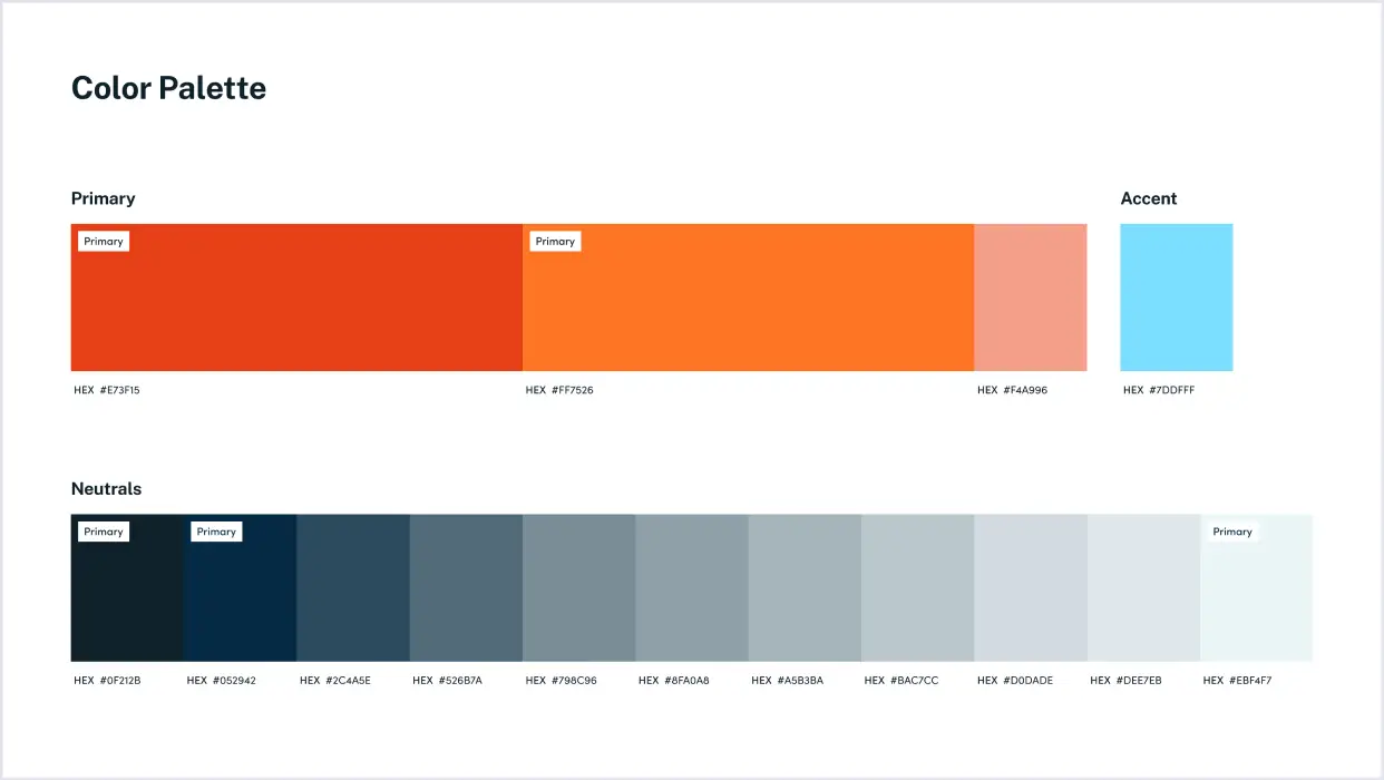
Email me at jlo2006@gmail.com
View

Police Department

Web Design, Print
Website redesign for one of the country's largest municipal police departments, reorganizing years of outdated content into a modern, navigable site that serves both the public and prospective recruits.
Web Design
Scalable Design System
Challenges
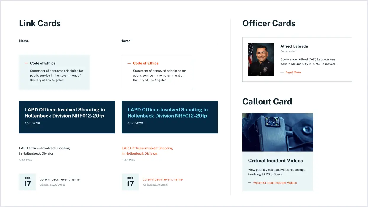
The existing site was bloated and hard to navigate, with an overwhelming amount of outdated content burying the information people actually needed. The goal was a modern, unobtrusive design that feels welcoming to the public while also appealing to potential recruits with a sleek, striking look. Balancing public perception with an exciting, professional image was central to the approach.
Design System
Due to budget limitations and the sheer size of the site, it was crucial to develop a robust and scalable design system that the police department could easily implement and expand on their own. The design system includes reusable modals, buttons, icons, and other web components, allowing the department to maintain a cohesive and consistent look as they build out new sections independently.

The design steered away from the traditional police blue, opting for a sleek palette of red-orange and blue-grey tones that evoke both warmth and authority. This modern color scheme helps the site feel friendly while also presenting a cool, striking appeal to potential recruits. Legibility and usability were key concerns, with the text-heavy nature of the content requiring clear typography and a well-structured design system to ensure easy navigation and accessibility.
Landing Page
The redesign focused on creating a streamlined, user-centered interface that simplifies navigation and enhances accessibility. Based on user behavior analysis, the information architecture was reorganized, with intuitive megamenus featuring icons for quick access to key sections. Quick Links were placed prominently below the homepage fold for immediate access to essential services.
Information Architecture
The internal pages carried the bulk of the site's content and had to make dense, reference-heavy information easy to find and easy to scan. A layered structure broke long content into digestible segments, reducing cognitive load and keeping pages legible despite the volume. Multiple paths led to the same information: full-text search, filters, alphabetical browsing, breadcrumbs, and jump links all worked together so people could search, browse, or drill straight to what they needed. Shared components kept every page consistent, so a bureau profile, a manual, and a data table all read as part of the same system even as the content shifted underneath.